
To celebrate this character’s historic milestone in style, as well as the 1984 Wonder Woman movie, director Patty Jenkins, Gal Gadot and Lynda Carter unveiled an impressive new logo, giving the legendary heroine a new symbol.
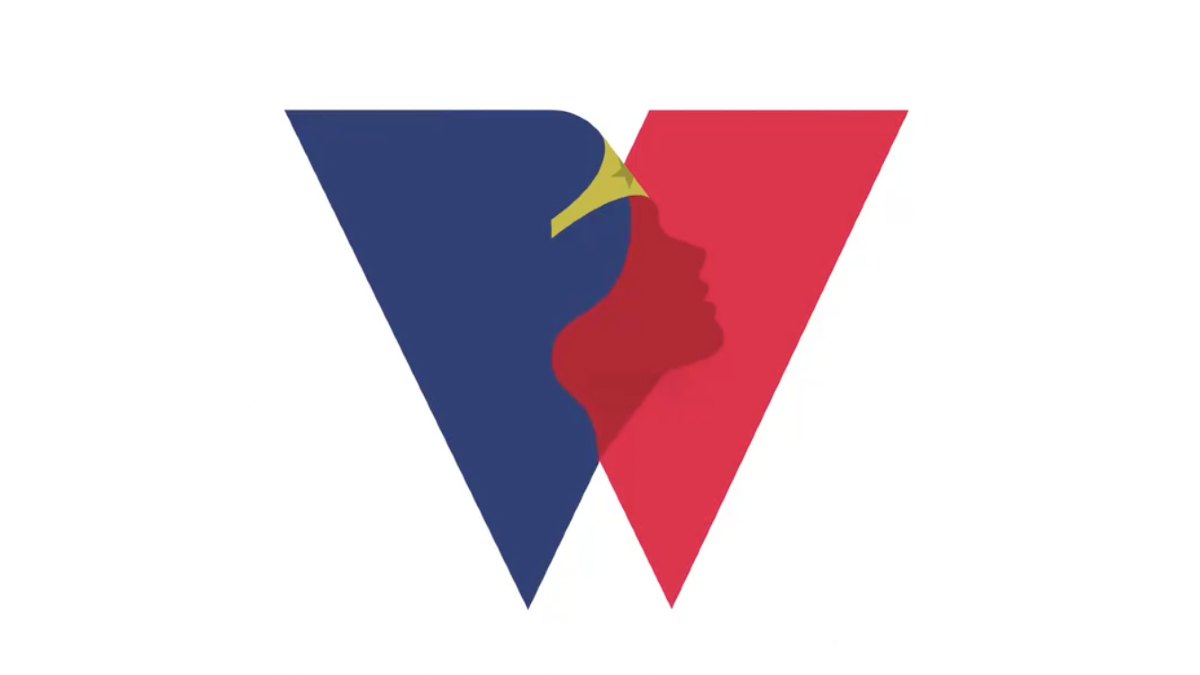
The logo features the classic red, blue and gold colors of the heroine. The symbol uses the letter “W” crossing in the middle, forming a silhouette of Wonder Woman. The logo is clean and contemporary, while paying tribute to the character’s comic book roots with the bold, two-tone aesthetic.. The official Wonder Woman account shared the animated version of the brand.
Next year marks 80 years of @DCWonderWoman, our Champion of Truth and Warrior for Peace. Check out the official anniversary logo that was just revealed at #DCFanDome, and get ready to celebrate in 2021! #DCWonderWoman pic.twitter.com/yHnK6nv96i
— Wonder Woman (@DCWonderWoman) August 22, 2020
Warner Bros. planned to release the film on October 15, but with the pandemic the premiere may end up being postponed to 2021. Some fans took to Reddit to share their love for the new design. “It’s so simple yet wonderful,” one gushed, while another described it as “extremely elegant graphic design”. We think it’s a suitably bold and empowering logo for a character like Wonder Woman, and in today’s world of dark and gritty superhero movie design, it’s refreshing to see a logo that wears its character’s colours so proudly.
While it isn’t clear exactly where the new logo will appear, we’ve no doubt DC has lots planned for Wonder Woman’s 80th anniversary next year – and we expect whatever it has up its sleeve to come emblazoned with the iconic new design.