Heinz, together with the creative agency Jones Knowles Ritchie (JKR), decided to create a unified brand for the entire world for the first time in 150 years.

To ensure a brand that works for the whole world, Heinz ended up needing to adjust its logo and visual identity. ” We wanted to create the unification of the brand across categories, geographies and touch points of the brand experience, so that, regardless of how or where you met Heinz, you could celebrate its simple greatness ,” said Jonny Spindler, managing director at JKR. JKR decided to take advantage of the fact that the Heinz brand is relaxed and with a young language to create fun looks. The agency relied on spaghetti, tomatoes and spicy beans in the new identity.
The new master brand involves a custom font, the ‘ Heinz Label ‘, which imitates the sans serif logo, ensuring that the brand incorporates a consistent typographic visual language. A secondary font offers a variety of styles.


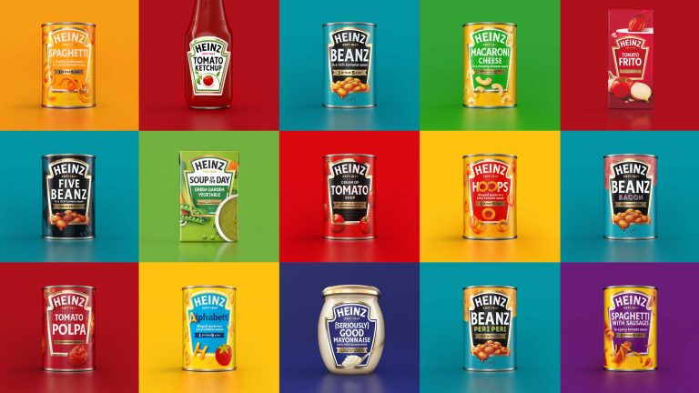
Heinz also won a new color palette of red, green, yellow, blue and white. The general overhaul aims to create the unification of the brand and convey the message of “simple greatness”. The premise of the packaging hasn’t really changed from the previous versions: whatever the container is, the iconic keystone shape is placed front and center (and large) with product photography and descriptions in it. There are a few significant improvements: There is now only two strokes to the keystone graphic, whereas before it could be three, it could be four, or it could be an inline treatment — the ketchup bottle seems to get a pass, as it still has four strokes. There is no more curved typography other than the Heinz logo, which now allows it to stand out more instead of blending in with all the other type-on-a-curve treatments. There is now a limit on typefaces used with only a few examples using anything other than the brand typeface, Label Sans. This instantly creates not just more consistency but elegant consistency, which is not something we often associated with Heinz products. Finally, the obligatory depictions of the ingredients and/or product on the packaging seem to have a more realistic illustrative style. Overall, the new packaging system looks infinitely better while retaining everything that is recognizable about Heinz.
