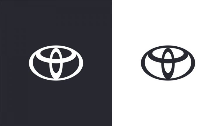
Toyota presented its new visual identity as part of the company’s journey to become a ” more progressive brand, ensuring longevity in the digital world “.
Designed by the creative agency The & Partnership , the rebrand, which includes a new logo, color palette and typography, will be implemented in the brand’s internal and external communications in the European division.
Toyota’s former oval symbol now gains a flatter 2D design, following in the footsteps of Nissan and Volkswagen.
A new sans-serif typography was also adopted, with the name ‘Toyota Type ”it was designed by Monotype in the hope of“ improving clarity and consistency ”in the brand’s communications. In addition, the brand received an update in the color palette, for a new cleaner black and white with red accents.

Speaking about updating the brand, Dan Beckett, head of design at The & Partnership, explained that the key to the project was to “ update the brand identity ” and “ prepare it for the coming years “.
“In addition to re-modernizing the brand, we also seek to bring a more premium feel, working hard to simplify the brand architecture and creating a design system that will be fluent in the contact points of today and tomorrow. Toyota recently made great strides in its product design and we really wanted to see that reflected in the visual identity, ”continued Beckett.
It has not yet been announced whether the new visual identity will be used worldwide or only in Europe.


